Friday, 6 February 2015

Explosion Box Using Bo Bunny Head Over Heels Collection

I like to browse the internet to get some inspiration for my work. Then I came across this beautiful heart explosion box made by Paloma. I think she is a Spanish, 'cause her blog was not written in English. She also has a youtube channel, but my brain is too slow to follow her instruction on the box. Hahaha. So here is her box that was made in March 2012, but still a classic beauty.


I think her design with the heart is unique and I am so grateful that she is generous enough to share her knowledge, so that people can learn freely.

I made a similar one for Valentine's Day. Luckily I have Bo Bunny valentine edition paper (this brand is one of my fave ever!!!). And here is my take on the box.
  
When it opens... Voila! It's like a combination of photo album, card and layout. There are 2 layers which I more heavily decorate is the top layer. I made flaps with magnets, pockets that can slide in photo (photo mat is inside also), inserts that you can write or simply put more photos (LOL) and that cute banner is from Memory Box Die.


The centerpiece is most crucial :). It will be the main attraction. Lol. Ta da!!! A tiny flower garden complete with the heart label. How cute is that!!


Here are the inserts for decoration, journaling or extra photo mat.

 Thanks for stopping by. Hope you like it!

Wednesday, 28 January 2015

Calligraphy Valentine Card Exchange

This will be a short post. I just want to share what I made for my calligraphy community. I have 8 people in my exchange list. Then I decided to make the card. Since this is a calligraphy exchange, I made the flower using my practice paper. Turn out fantastic.


I embossed white cardstock, painted them with diluted  Art Anthology dimensional paint to give that watercolor effect, splattered some black paint, and stick my calligraphy paper flower. Voila ! I wrote the greetings at the back using light gold gouache.

Happy Valentine's Day!

Saturday, 17 January 2015

Urban Chic

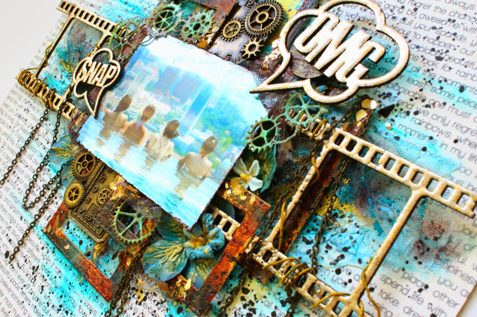
I saw this photo on my sister's timeline and thought "The view is awesome!". The photo was takes yearss ago and apparently I was there but hiding from the sunshine (LOL!). It is the ever famous infinity pool at the sky garden of Marian Bay Sands Hotel, which is 200 meters or 57 stories high above the ground. The view was like nothing I had ever seen before. Stunning!!

So here is my interpretation of the photo. It is unlike any other resort with infinity pool overlooking the sea, but a landscape of sky scrappers.


I used the bubble speech chipboard and negative film chipboard from Dusty Attic and embossed the using Stampendous embossing powders. Lots of texture at the background, and this time I use tissue paper and tulle to give a softer look than stencil. Various brown, gold, and blue paints from Art Anthology to create the depth and rusty finish. 


I made this layout to join Dusty Attic mood board challenge click here . Also the Off The Rails Scrapbooking January Challenge click here .

Thank you for stopping by!!


Saturday, 10 January 2015

Adorable Niece


Happy New Year!!! This is my first post this year. I made a layout using my 1.5 months niece. I am such a proud aunty. Lol. As proud as her parents. Lol.


For this one, I am trying to give a soft deamy look with a lot of tiny detail texture. First, a lot of texture on the background using doilies, lace, and stencil (Bo Bunny).  The paper I used is from Blue Fern which is one of my current favorite. I tore all the images along the edge and re-arrange them to frame the photo.

Here a closer look for you to see more details on the background. I used Ranger mat gel medium to glue the doilies and all the lace, then clear gesso everything. I brushed pink paint mixed with gel medium to create the translucent look. Texture paste is from Ranger (another awesome product).


The clock is from Tim Holtz Alteration clock die. Cut a thick cardstock, covered it with texture paste, then dabbed turquoise paint.


I made the tulle flower to match it with the baby headband. :)). Colored the inner part with the same paint and white gesso-ed the outer part. Stick some glass beads to give more texture on the frame.


It was inspired by :
1. Blue Fern Sketch Challenge. Click here.
2. Scrap Around The Wold January Challenge mood board that I enter. Really love the idea and mood they set. For more detail Click here.


Thanks for stopping by. Hope you like it !

Tuesday, 30 December 2014

Valentine Album Using Crate Paper Kiss Kiss Collection and Love Notes Collection

Hi, Everyone! I know 2014 hasn't passed yet, but I already posting a valentine album. LOL. I saw these super cute papers from Crate Paper, Kiss Kiss is their new collection for 2015 valentines day. Then I got images flashing over my mind on what I want to do with it. Lol. The mojo is here!!! So there you go!

The color theme is pink, red, white, and a bit of teal. Here the cover. I made a photo guide for the frame and actually the little black dot thingy on top of it is a pull out tag for the photo guide. Honestly, I come to love this album so very much. I think it is one of my favorite.

You can see there are lots of flaps and layers to the pages. Of course we all need those extra spaces for our humongous photos we took on our special day ;)


1st page. Flap opens to the left. In the flap, I insert 2 loose tags. Btw, I made the crochet heart myself :D

2nd page.

3rd page. Below the baloon got small loose cut outs. I secure the tri-fold with twine. Inside the folds also got loose tags and cut outs.

4th page. Layer a very pretty tissue paper with hearts inside it the paper ( I think its handmade ). Then open up, you can see a small shopping bag with loose booklet that you can pull out. Next to it are loose cut outs.

5th page (left side) is quiet straight forward. I layered top and bottom part with some border punch and velvet ribbon, then paste flowers, hearts and crystal pin. 6th page (right side) I made a frame with photo backing that you can pull out (see the fabric tab on top), also slip a loose cut out says "True Love" (aww..).

This is what page 6 look like when you open it. Actually the frame is 2 sides so you can alternately switch the photos. Again loose tags and cut outs. The camera from Kiss Kiss ephemera is sooo cute, it has a gold heart at the center (oops, sorry the pic was blocked by the tag).

7th page. A swinging journaling card with photo frame.

8th page. Another layer of tissue paper, but this time I add a gold heart die-cut from sizzix. 

9th page. The journaling card can flip up and reveal pocket that I made using the tissue paper and doily. Very pretty as you can see thru the paper. 

10th page is our last page in the album. The paper I cut from Echo Park Lucky In Love collection. I made a pocket where you can pull out another page (see the fabric tab).


Sunday, 28 December 2014

Camera Album Using Prima Coffee Break Collection

Recently I made quite a few camera albums (will post other album later on). Camera album is simply a 4.5" by 6" journaling album that use camera die cut on the cover. I use Sizzix camera die as I find the size and gives me a lot of room to decorate the camera according to the album theme.

This time I used paper from Prima Coffee Break Collection. Use some of the 12x12" papers, 6x6" paper, the 4x6" journaling pad, and the 2 sets of stamps. Actually the collection also comes with the 3D stickers but I need quite a lot of it, so I made them myself. I stamped the images repetitively and watercolor them, then layer a few depending on how dimensional you want. Lastly coated it with glossy accent.

 On the first page, I made a tri-fold and secure it with the string. The right side is where I put together all the pages using coptic stitch. The book contains 5 booklets, they are called signatures. I only decorated the first page of every signature. As you can see inside the signature is plain pages, where they can write, paste photos, or draw. 

The 1st signature. Made a polaroid frame to slide photo in. Also got a love letter which I tucked on the top left.


The 2nd signature. The oval page is to put photo and also can flip up. Left side is a loose tag.

The 3rd signature. Also a polaroid frame to slide photo and there is a pull out page behind the frame. Another loose tags and cut out image tucked.
The 4th signatures. Left side is an open up small booklet with pocket for the tag. Right side as you can see there is a page already flipped up. Then the 2 cards can be pulled out to use separately, also can flip open to the left.
The 5th Signature more straight forward with lots of 3D self-made stickers :)


Hope you enjoy. Thanks for viewing. More to come!


Sunday, 21 December 2014

Rustic Theme Wedding Album

One of my good friend was getting married. I have known her for almost 10 years, and was started as my sister's friend then become more like a family. Known her since she was in high school and now she was getting married!! Don't know where the time has gone to ?!?!?! Wanna give her something special that is not just a packet of money ( In asia, it's a custom to give packet of money as a wedding gift ).

Here it is a simple rustic wedding album. Actually this album is the second one I made, so please pardon the simplicity and yet I would like to share the thoughts and ideas I had. Made using Simple Stories Story of Us collection. The album was made from scratch using chipboard for each of the 6 pages. There's a frame that she can put her photo in. Burlap sheet to cover the spine with little charms of lock and a key hanging.


Some closer view on the flower details. I use the flower triplits from sizzix and die cut a few layer of cardstock, vellum and glitter paper. Then the centre I put glass beads. I suggest to use glossy accent rather than glue. It is super strong.


Here some of the pages I made. I just realise that I didn't take the every pages, so here a few only. The album already given out to her. This page I a bit of medium from Art Anthology to create a dimensional gold flourish background. I used it like a texture past over a flourish stencil. The color was great, but the downside is the finish surface is a bit tacky if I pressed it against the other page, like if I force them apart, some of the paper was torn n stick to the flourish. So I put flowers to create a gap between the page. Anyway, who doesn't love all these gorgeous flowers! Also you can see at the bottom, I scattered gold mica flakes.

 I made the banner with kraft paper and vellum. Very easy, just cut them rectangle and layer, hole punch them together, pull a string thru and voila, you have a banner. The little cute hydrangea flowers are from Martha Stuart punch. This punch is one of my favourite!! You will see more of these flowers in my future projects.


There you go. I hope my little project can share some inspiration to others. Thanks you for looking.